
Creating Levee's Brand and Mobile Experience
I was approached by a fellow bruin, Damien Sutevski, who wanted to create a mobile solution for tax prep and filing. He thought there had to be a less time-consuming way to file your taxes. This was when he created Levee with Argel Sabillo. They wanted to create an app to be used everyday for short amounts of time and come tax season, the app would file the taxes for our users.
Throughout the first year of the start-up, my role as the UX Director entailed working closely with both Damien and Argel to come up with the brand, user experience and user interface for Levee.
Before creating the mobile solution, we first needed to understand what it takes to file taxes, how people were filing them and how they felt about them.
- My Role: Branding, UX, UI
- Platform: iOS Mobile App
- Collaborators: Damien Sutevski (Co-Founder, Technology) & Argel Sabillo (Co-Founder, Business Development)
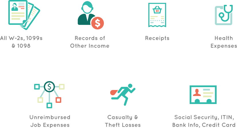
That’s a lot of information! Many people find it time-consuming to gather all their documents in order to file their taxes. Once the documents are together, some store them in boxes, folders and in an ideal scenario online. Even if the users store them online, it’s typically not organized to make filing taxes easy.
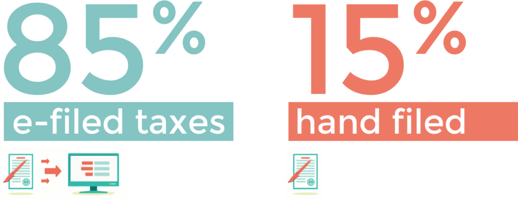
85% of american e-file their taxes today. Some advantages of e-filing are that it’s more convenient, fast, more accurate and refunds are received faster. Hand filing taxes is tedious but 15% still do so because it’s a good option for users without access to a computer or internet. Hand filing is also great if you’d like to get to know the tax code.
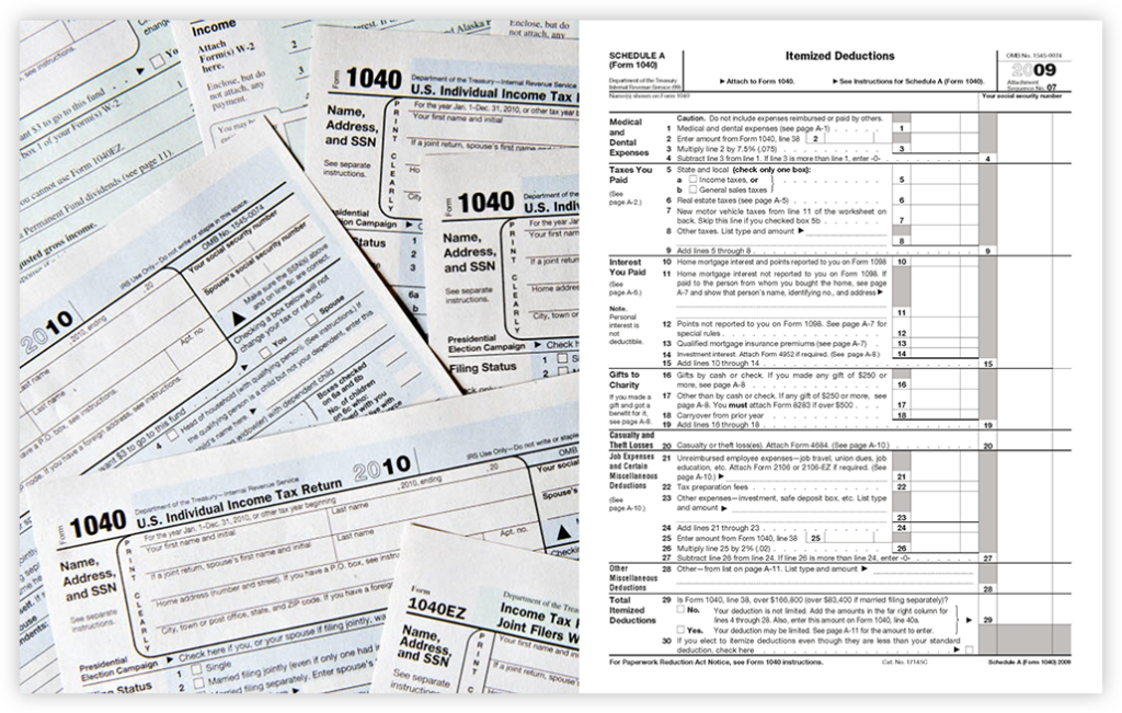
Example of the 1040 form.
Tax Day: Yay or Nay?

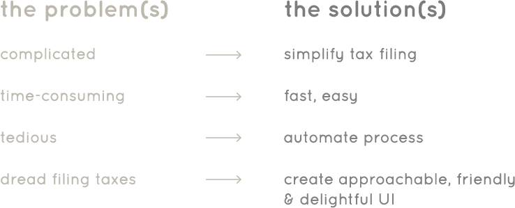
One of the reasons why people disliked doing their taxes is because it’s complicated. The 1040 used to be 27 lines and today it’s 77 lines long. It’s so complicated it needs a 189 page appendix filled with instructions. Other reasons include that it’s time-consuming, it’s expensive and many have an unfavorable view of the IRS. Others find taxes to be unpatriotic (remember the Boston Tea Party?)
Once we understood the current tax filing process and how our users felt about them, we identified the problems and set goals on how we were going to solve them. The core of the app would include an automated process which would reduce time-spent gathering documents and allow our users to skip the tedious step of gathering their documents.
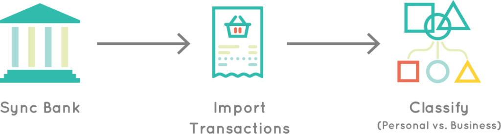
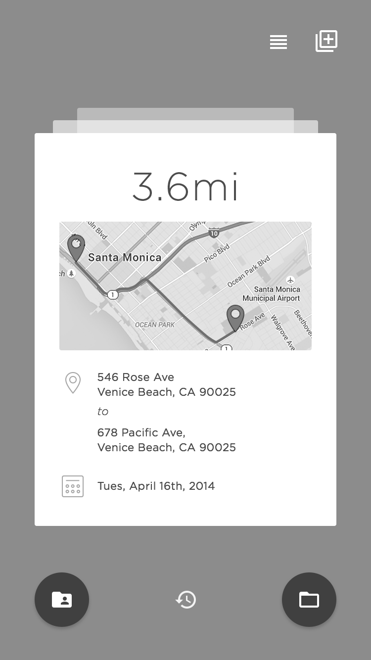
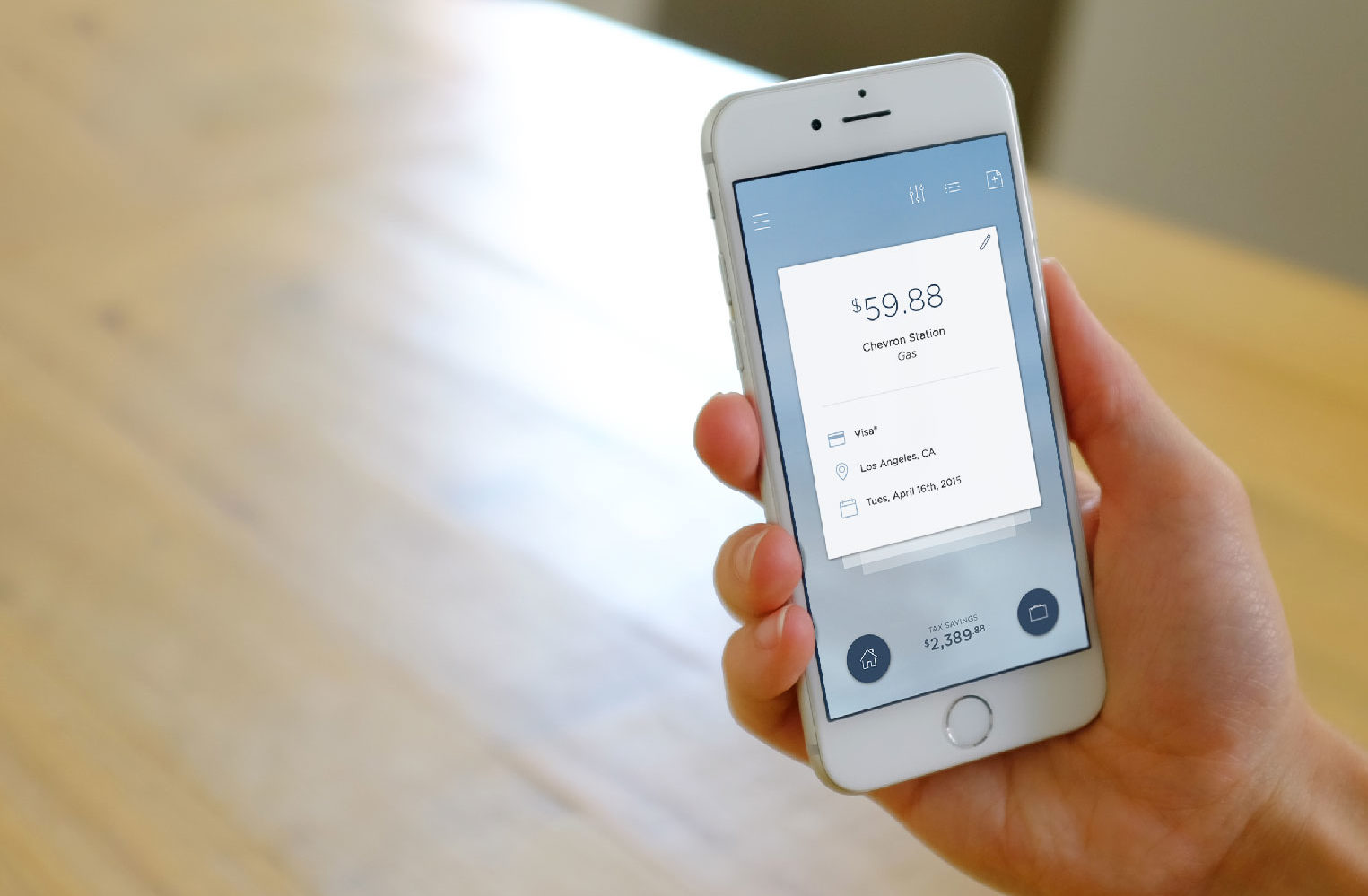
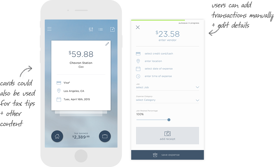
Most transactions we do today are all done electronically. To help users file their taxes faster, users would be able to sync their bank accounts with the Levee app and import all their transactions. The users would then classify their transactions as personal or business and Levee would be able to perform tax calculations based on that.
Eventually, the app would also learn how the transactions are classified and predict the user’s spending. Users will will also be able to indicate all transactions on a specific business card if they had one account for all their business expenses.
Version1: Drag & Drop
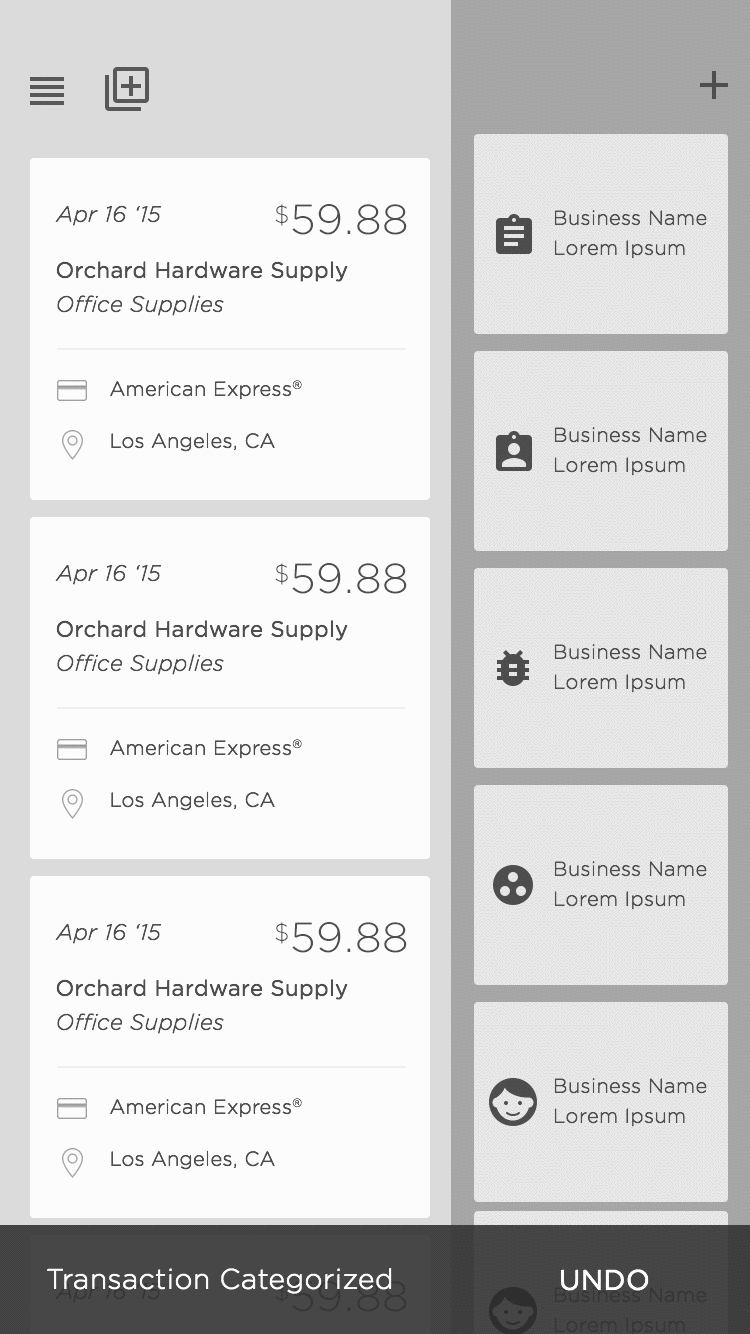
The most challenging part of the automated process was figuring out the fastest way for users to sort through multiple transactions. The first exploration was a drag and drop approach where users would drag transactions from the left panel to their jobs on the right panel.
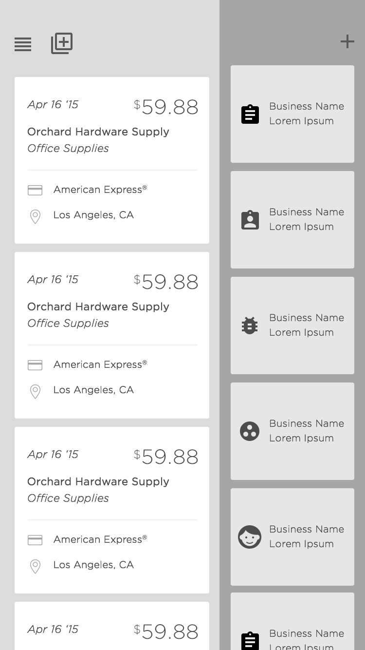
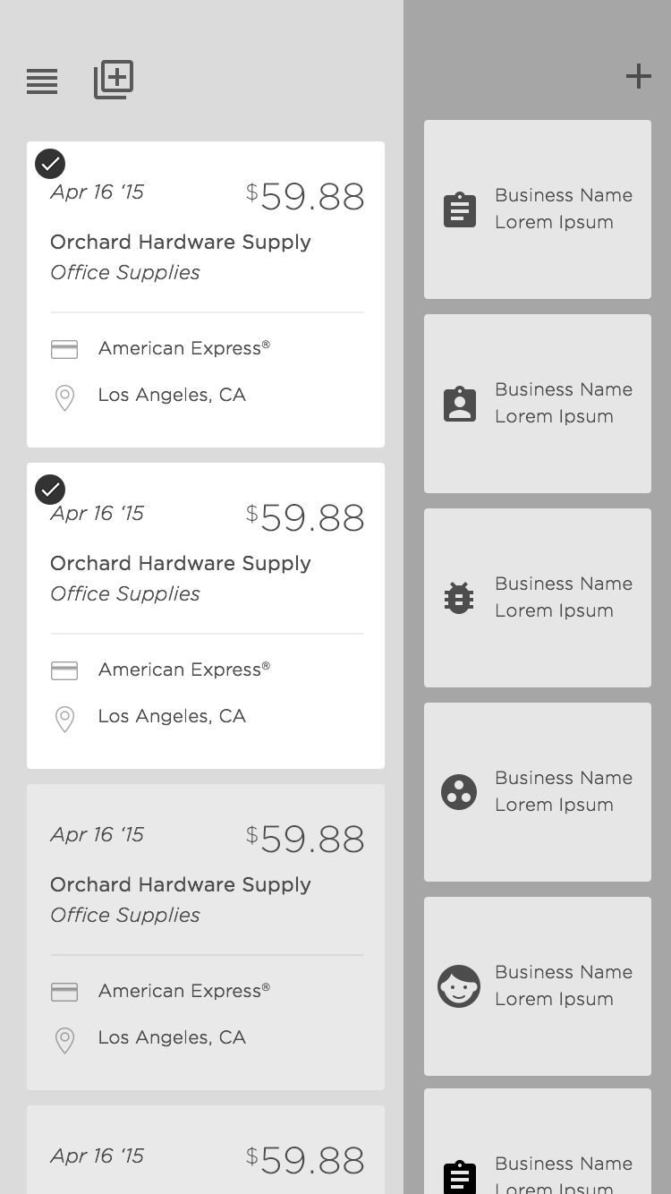
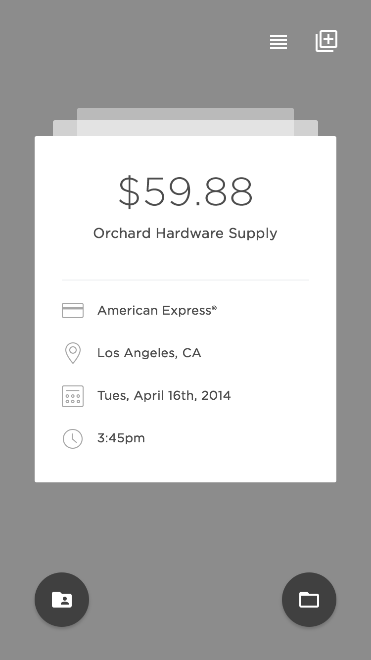
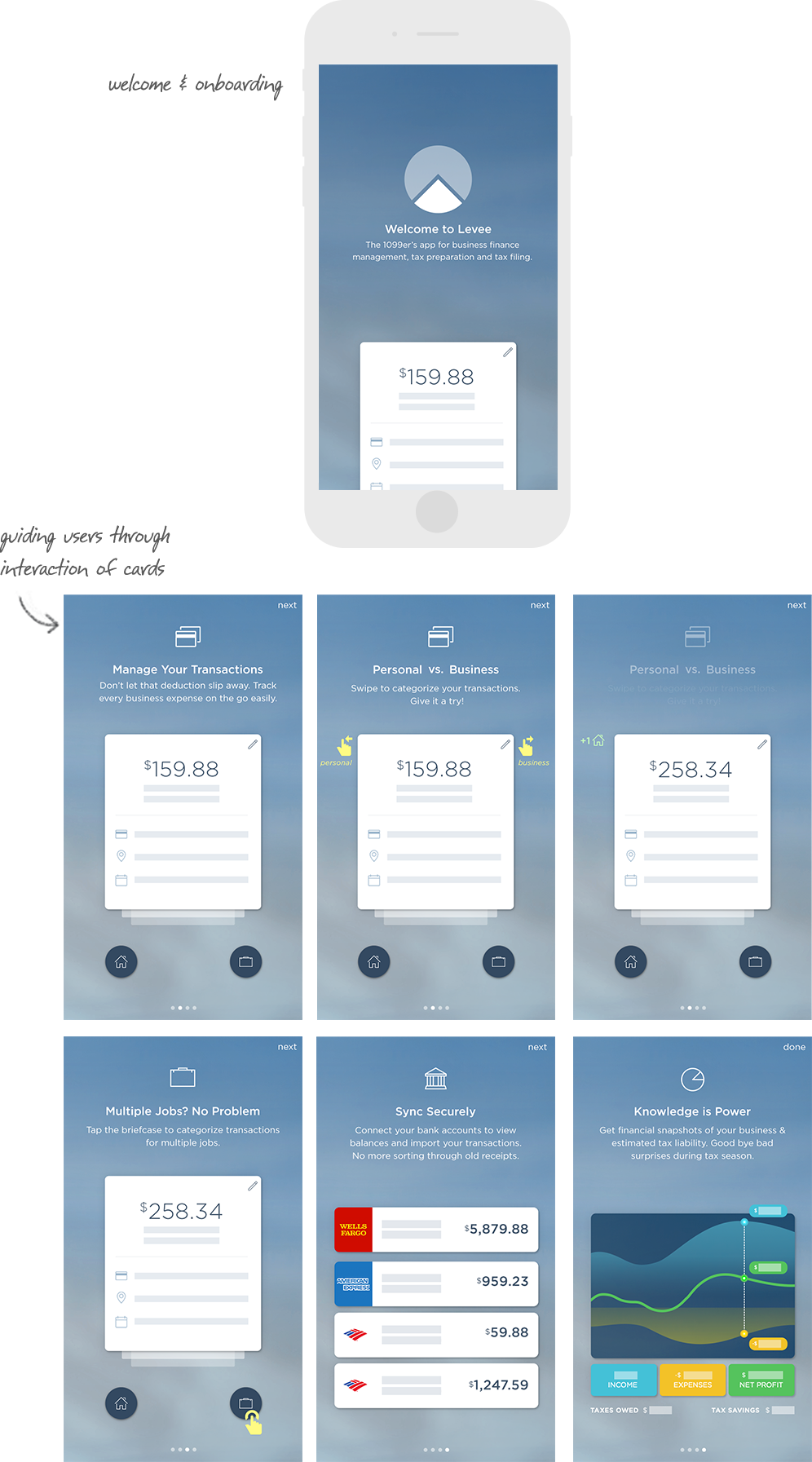
Version2: Cards
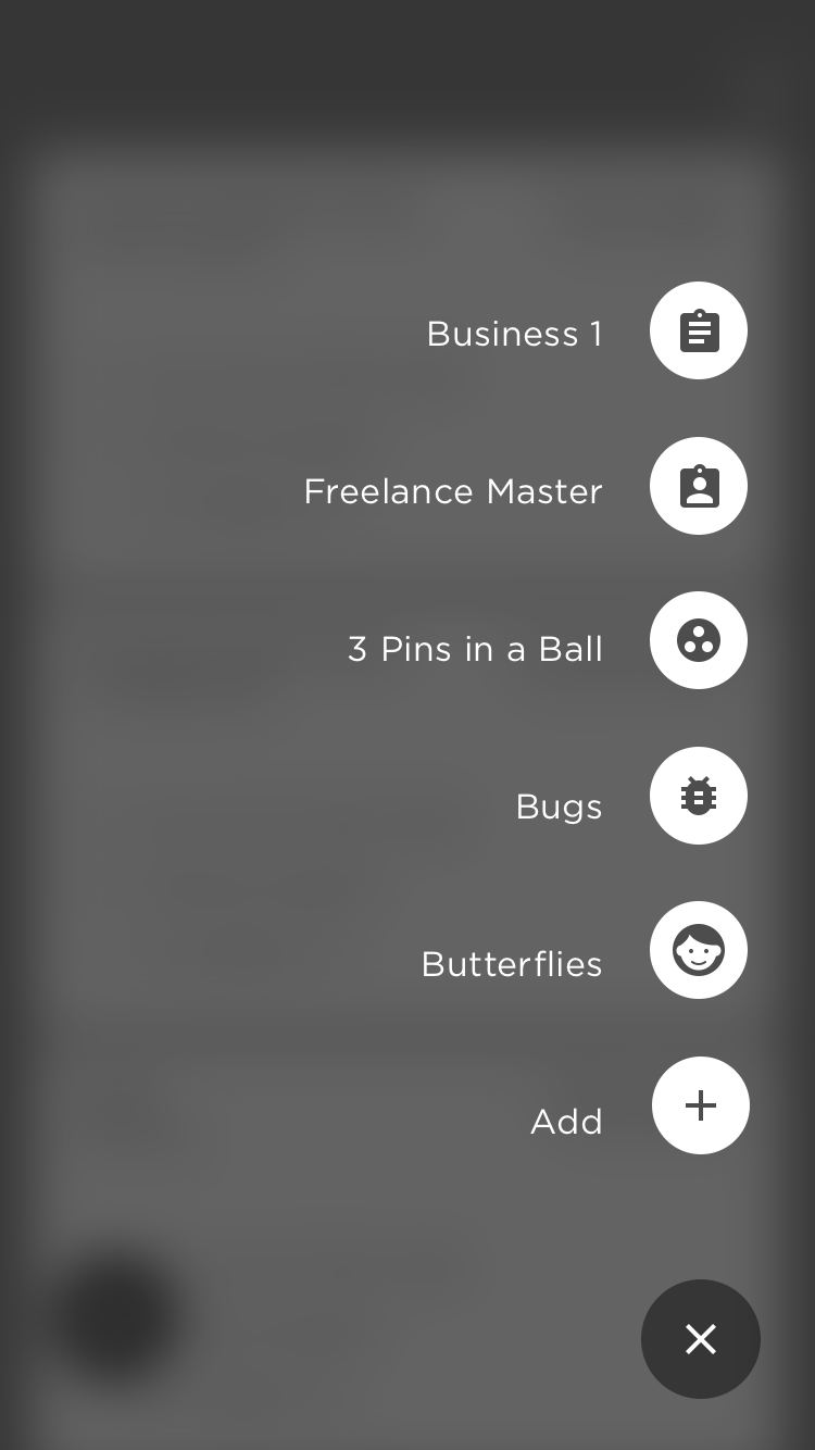
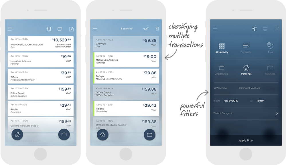
Rather than viewing multiple transactions, users would focus on one transaction at a time and either swipe left to indicate a personal transaction or swipe right for a business transaction. If a user had multiple jobs, any swipe to the right would go to their default job. The user would tap on the right bottom icon to select from their list of jobs and classify transactions that way.
The card view was great for sorting through individual transactions but was not convenient if you had to sort through 20 transactions. To tackle this, we introduced a list view with the same concept that users can use the bottom floating menu items to classify multiple transactions that were selected.
After some testing, we found that users liked both versions but found the drag and drop a little overwhelming and showed too much information at once. They preferred to view transactions one at a time or in the list view. We moved forward with the card/list view version.
Explorations: Sketches
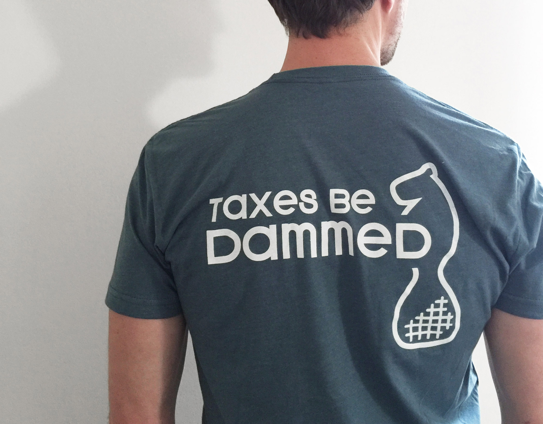
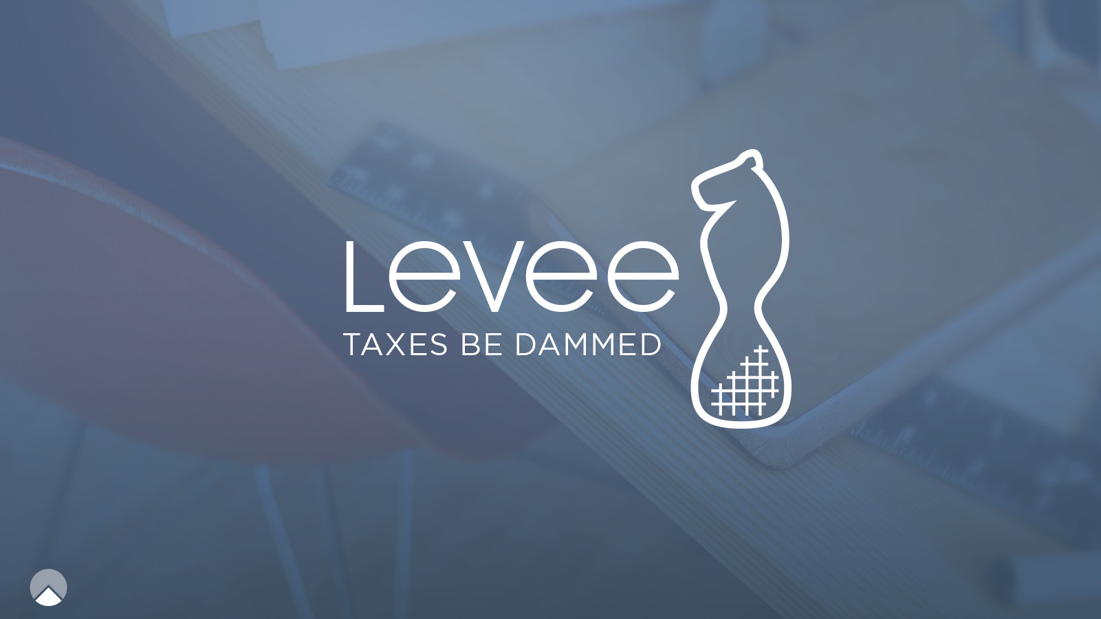
I wanted to introduce a little humor to the brand so I started to explore unconventional visual representations of taxes. I first thought about things that were associated with Levee… well a dam. A dam isn’t so fun but a beaver is. Explorations with a beaver in the logo commenced.
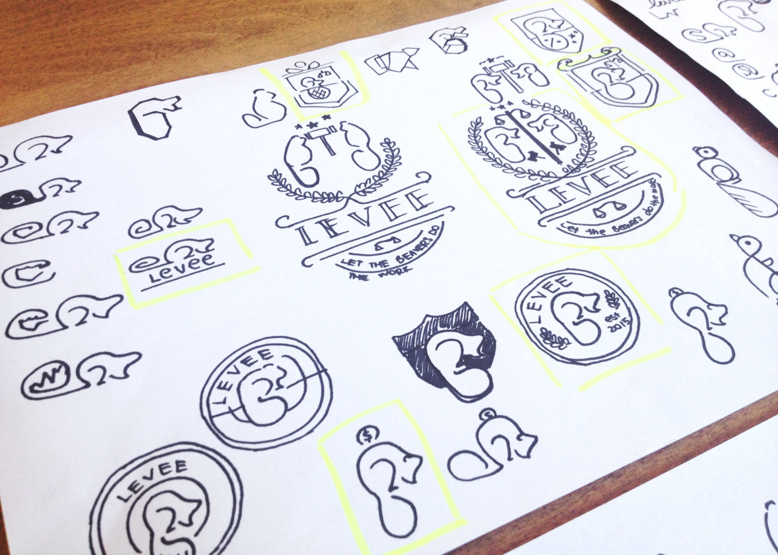
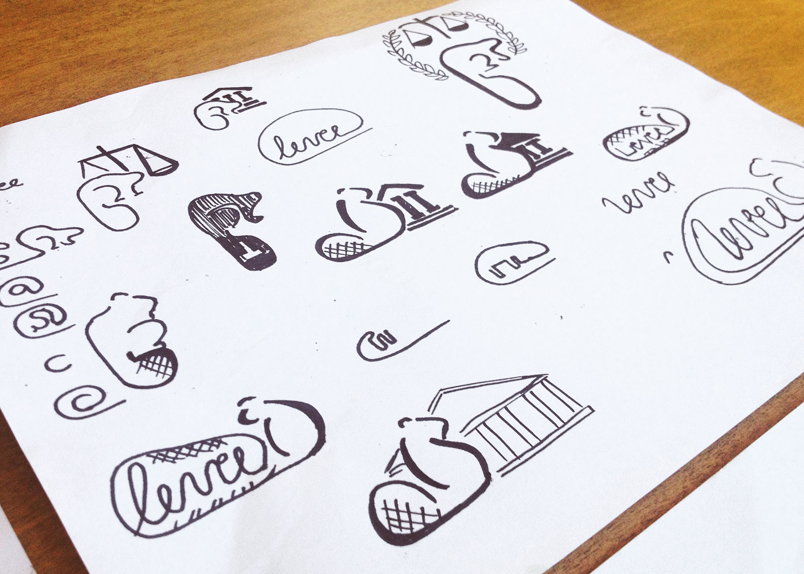
What we ended up with was very different from the initial explorations. We asked users which logo they would associate with a tax app during a survey. The users selected the pie logo and liked the simplicity of the logo and thought it looked modern. Perhaps if we had asked which brand users would trust more and showed the logo in context on a website, we would have gotten different results.
The beaver explorations didn’t go to waste though! I really believed in the concept of a mascot for Levee so we made some T-Shirts. The shirts had the beaver with the tag line “Taxes Be Dammed” in the back and the Levee logo in the front. We gave the shirts away at a networking event and people loved them! There was something about the tag line, the beaver and the logo all working together. The beaver will make its appearance in the app soon after more testing.
Prototype:
The team used an Invision prototype for demos, to test the designs within the team and to gather feedback from a select group of users. The prototype was also a great communication tool to communicate between design and development during the iteration phase. This is the prototype most similar to the final product launched in July 2016.
INVISION PROTOTYPE