
Innovating Care-Sharing & Communication in Healthcare
Care3 is a company that improves care coordination for patients, their families and professional caregivers. When Care3 came to me, they were in the beginning stages of starting their company. They needed a designer to create a brand and the entire digital experience for all their products from the ground up.
Within the first few months, I worked closely with one of the co-founders to create a demo for funding purposes and to kick off development. Since then, we’ve launched the iPhone app, iPad app and the pilot launch of the admin portal.
- My Role: Branding, UX, UI
- Platform: iOS Mobile App, Responsive Web
- Collaborators: David Williams (Co-Founder, CEO, Product), Jon Chun (Co-Founder, Product Strategy), William Mintz (Co-Founder, Business Development)
1. Care/Discharge Plan Distribution
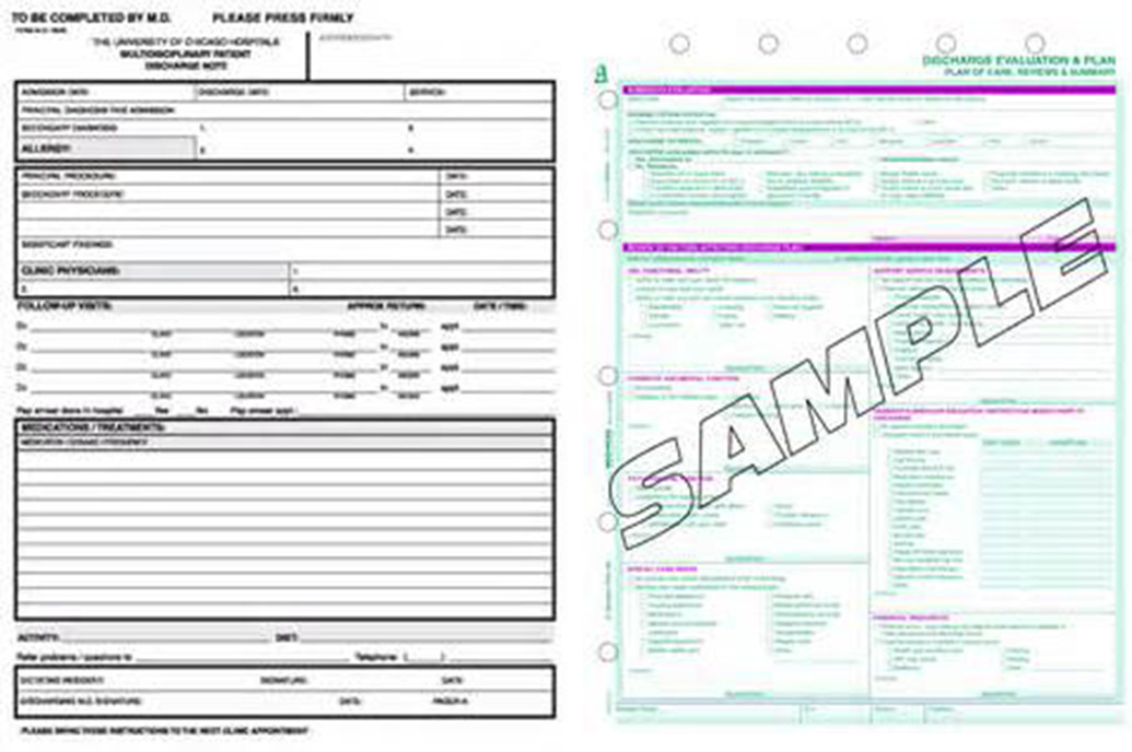
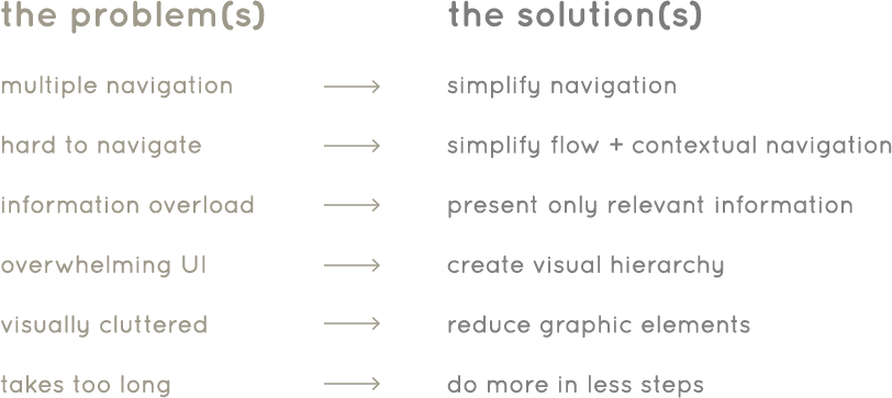
Many patients are still given physical care plans to take home when they are discharged from a hospital. These plans sometimes get lost and when patients don’t follow the care plan, they are often readmitted. The physical care plans are also very tedious for the care professional to complete.
2. Patient and Family Engagement
Why is patient and family engagement so important? Patients rely on their support system for care. Without it, patients are less likely to follow their prescribed care plans and run the risk of hospital readmissions.
Since the care plans are physical plans, sharing them with friends and family isn’t as easy as sharing a juicy story on Facebook. This makes it harder for patients to find the support they need. Even if patients have support, caregivers aren’t able to share responsibilities easily. To make matters worse, different tools are used to communicate, schedule and manage tasks.
3. Tracking Care Plan Progress
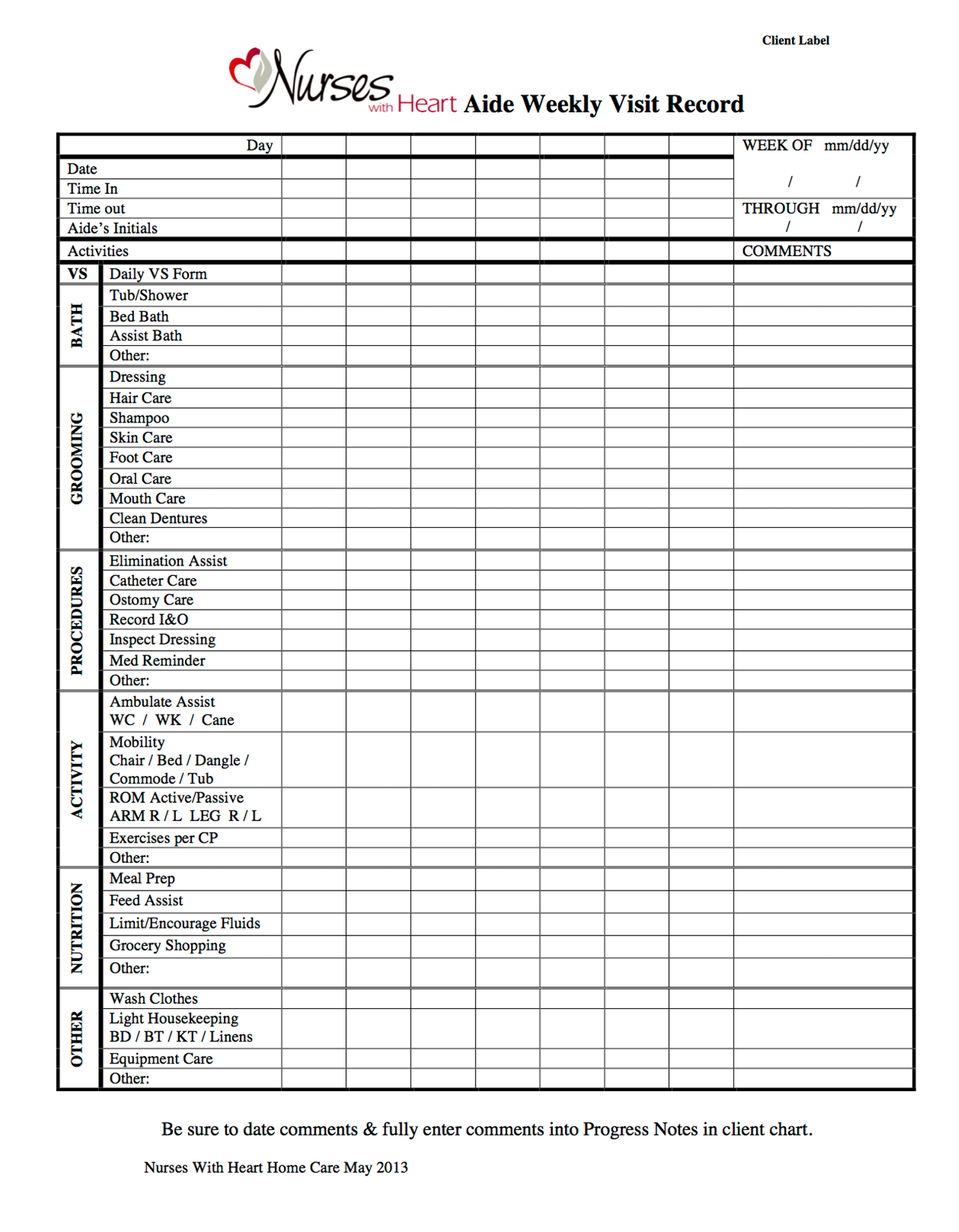
In order to get paid, professional caregivers must submit daily reports on a weekly basis. This report is mostly done on paper and is very time consuming. To save time, many caregivers complete all the paper at the end of the week which leads to inaccurate reporting. The data on these reports is also not sharable.
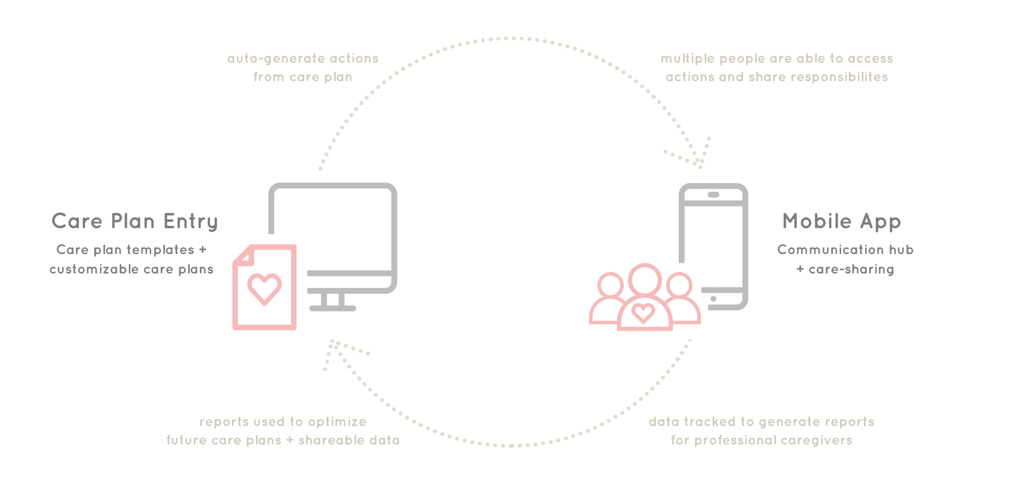
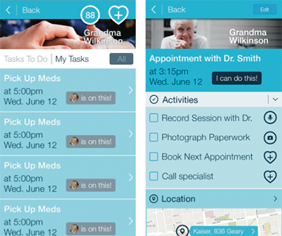
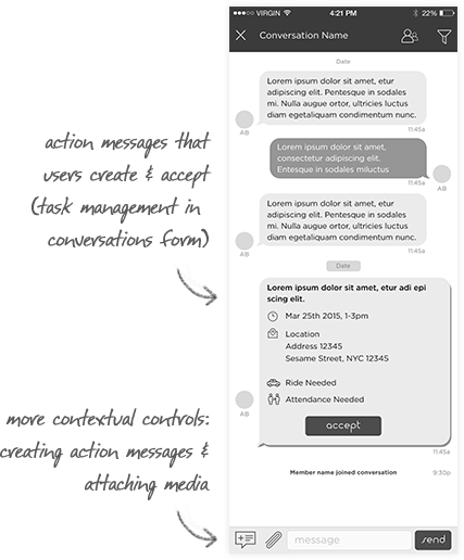
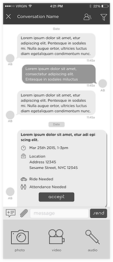
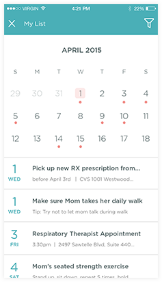
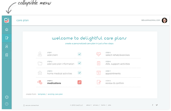
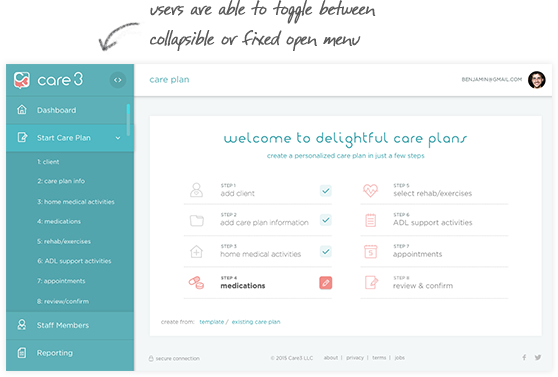
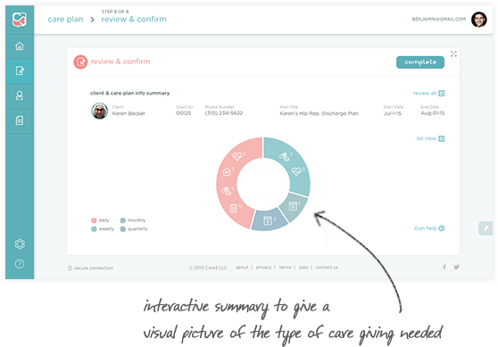
An integrated platform consisting of a care plan creation portal and a care-sharing mobile messaging app. Care coordinators are able to create digital care plan templates and customized them in the portal. Once created, these care plans will automatically generate actions in the mobile app.
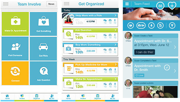
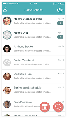
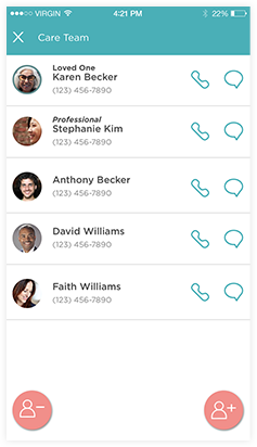
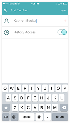
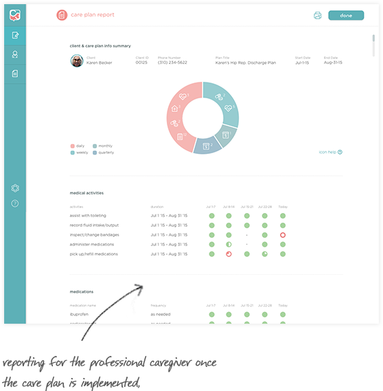
The mobile app acts as a hub for communication, task management and care-sharing. Patients, family members and professional caregivers are able to share tasks, actions and keep all relevant information in one place. All actions are also tracked and reported for the professional caregiver for submissions.
The goal was to create a mobile app prototype in a month to be used for investor demos and to kick off development. The founders had launched a caregiving app before but users thought the app was overwhelming, confusing and hard to use. This time with Care3, we needed to build an app that anyone could use — even someone who just learned how to use an iPhone. Simplicity and seamless communication were what we sought for.
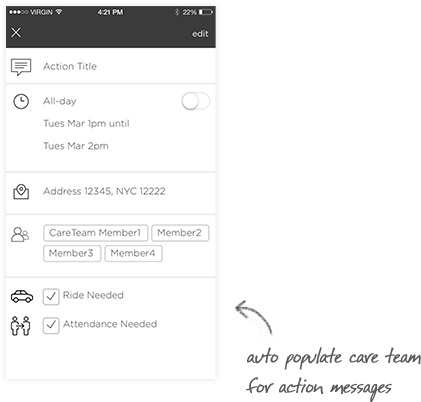
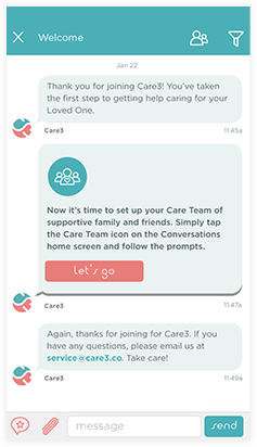
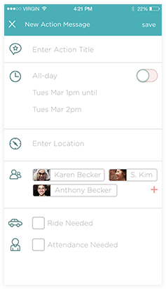
What is the most simple form of digital communication? Text messages. Messaging is the most basic form of mobile communication (besides actually calling someone) and most users are familiar with messaging. It was the perfect framework to build upon. Additional features such as allowing users to manage tasks (Action Messages) were added to make messaging more powerful.
Previous Designs:
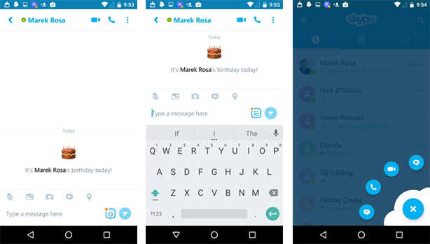
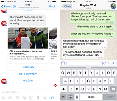
The messaging space has been more saturated in the last few years and many of them have changed the way we communicate digitally today. WhatsApp, Snapchat, Facebook Messenger and Skype were very popular in our demographic. It was important to review what’s been done and also identify patterns that our users would find familiar.
With the goals of relevancy first and anticipating the user’s needs in mind, a contextual approach was taken in the app flow. Features were written on sticky notes and then grouped together based on how users would use them when communicating and care-sharing. Once the features were grouped together, the app flow started to take shape. To simplify the flow even more, more steps were streamlined and MVP features were also identified.
App Flow (PDF)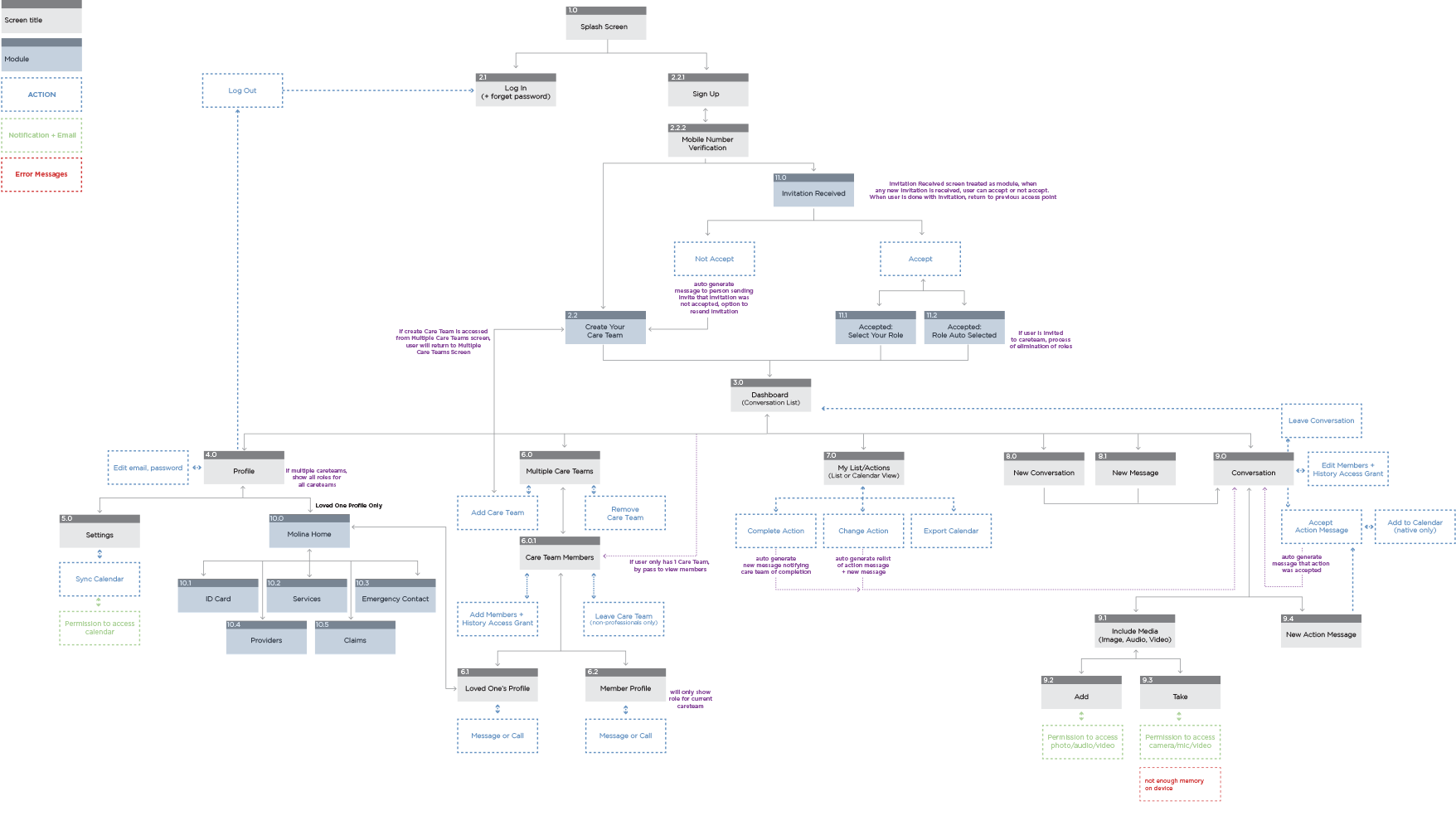
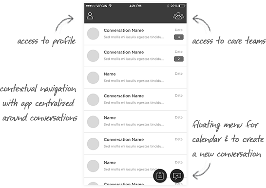
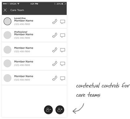
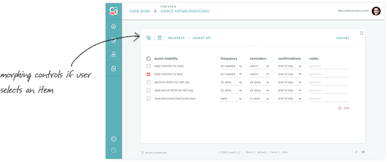
Next, screens were laid out to match the app flow. The goal was to maximize clarity, reduce cognitive load and ensure that the flow was intuitive. A contextual navigation was applied, revealing controls that were relevant to the user at each step.
Wireframe Prototypes:
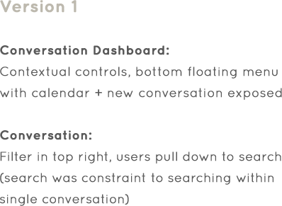
Version 1 was chosen as the direction to go with as the main controls (calendar, new conversation) were in the bottom right which made it easier to reach when holding a mobile device.
After the app flow and wireframes for the main features were done, several design explorations were done for the branding of the app. Some internal testing was done with the wireframe prototypes but due to the time constraints, user testing was postponed until after the visual design phase and after the investor demos.
Branding
When it came to branding the app, the mindset of the patient and caregivers were taken into consideration. Caring for a loved one can be a daunting task and be emotionally draining. I thought the app should be pleasing, give users a mental break with calming visuals and perhaps lighten a person’s mood when using the app. The brand and UI needed to make the users feel welcome and needed to feel light, warm, approachable and trustworthy.
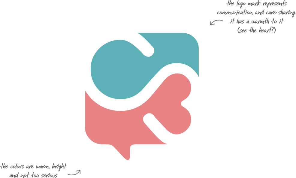
Final Logo and Color Palette:
Applying the Visual Designs
When it came to branding the app, the mindset of the patient and caregivers were taken into consideration. Caring for a loved one can be a daunting task and be emotionally draining. I thought the app should be pleasing, give users a mental break with calming visuals and perhaps lighten a person’s mood when using the app. The brand and UI needed to make the users feel welcome and needed to feel light, warm, approachable and trustworthy.
Investor Demo Prototype:
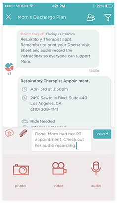
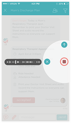
Prototypes follows a script that the co-founders used to present how a user might use the app to manage their mom’s discharge care plan. The flow shows how action messages are created and accepted, messages with tips from Care3 and how a user might record an audio recording from a doctor’s office.
Turning forms into an easy to use digital portal
With the mobile app launched, the team then tackled the experience for the care professional. The same design approaches used in the mobile app were applied to the care plan entry portal. This portal would be accessed by professional caregivers on desktop and tablets. The challenge was to design a system that made entering lots of information simple and fast.
Due to the time constraints, the UX and UI were done at the same time. Since the portal had to work on tablet, I wanted to maximize screen space and have the user focus on the content. Prior to starting, best practices for forms were studied and an analysis of data entry systems was conducted.
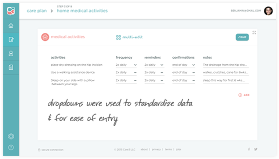
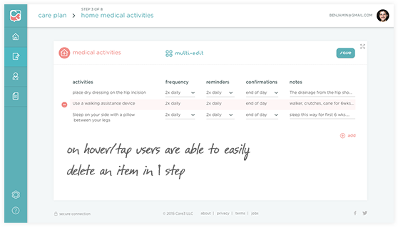
To start, the forms were broken down into digestible sections and users would always have a default template to begin with. The default template reduce the amount of data point entry and allowed the user to customize as needed. The Care Plan Entry Portal also allowed the user to create their own templates.
Care Plan Entry Prototype: